Fair isn't the middle
It started as a fair midpoint and a suggestion at 3:33 every week. It launched as a map of the places your friends love, with the same math still picking where you go.
333 is an iPhone app for getting your friends out to the same place. you save the spots you want to try, see the ones your friends love, and make a plan for the night in one sentence. under every plan sits a harder question. Sam is 1.6 km from the middle of the group and Jo is 3.6 km away, but Sam walks and Jo takes the train, so Sam's trip is 23.8 minutes and Jo's is 18. the closer friend has the longer night. so where is fair, if it isn't the middle?
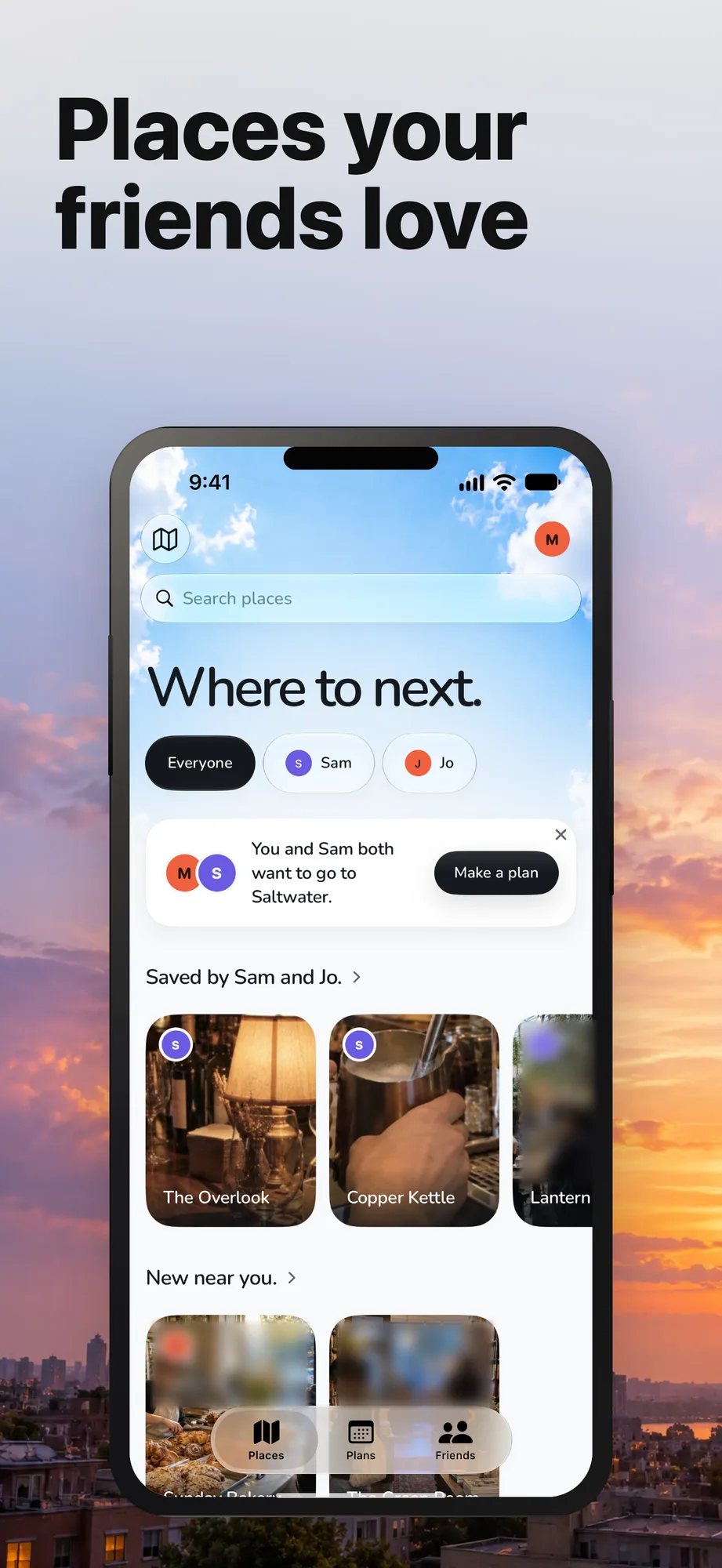
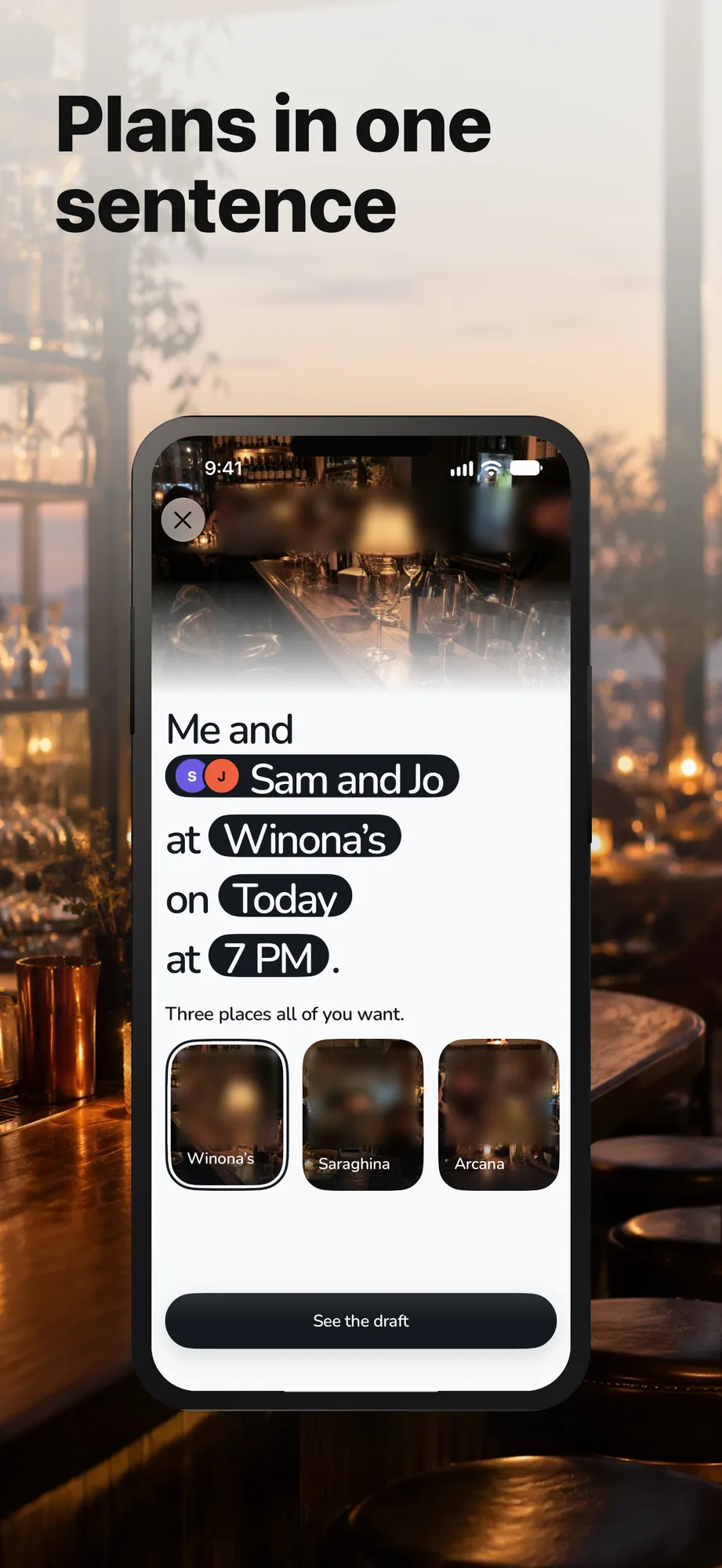
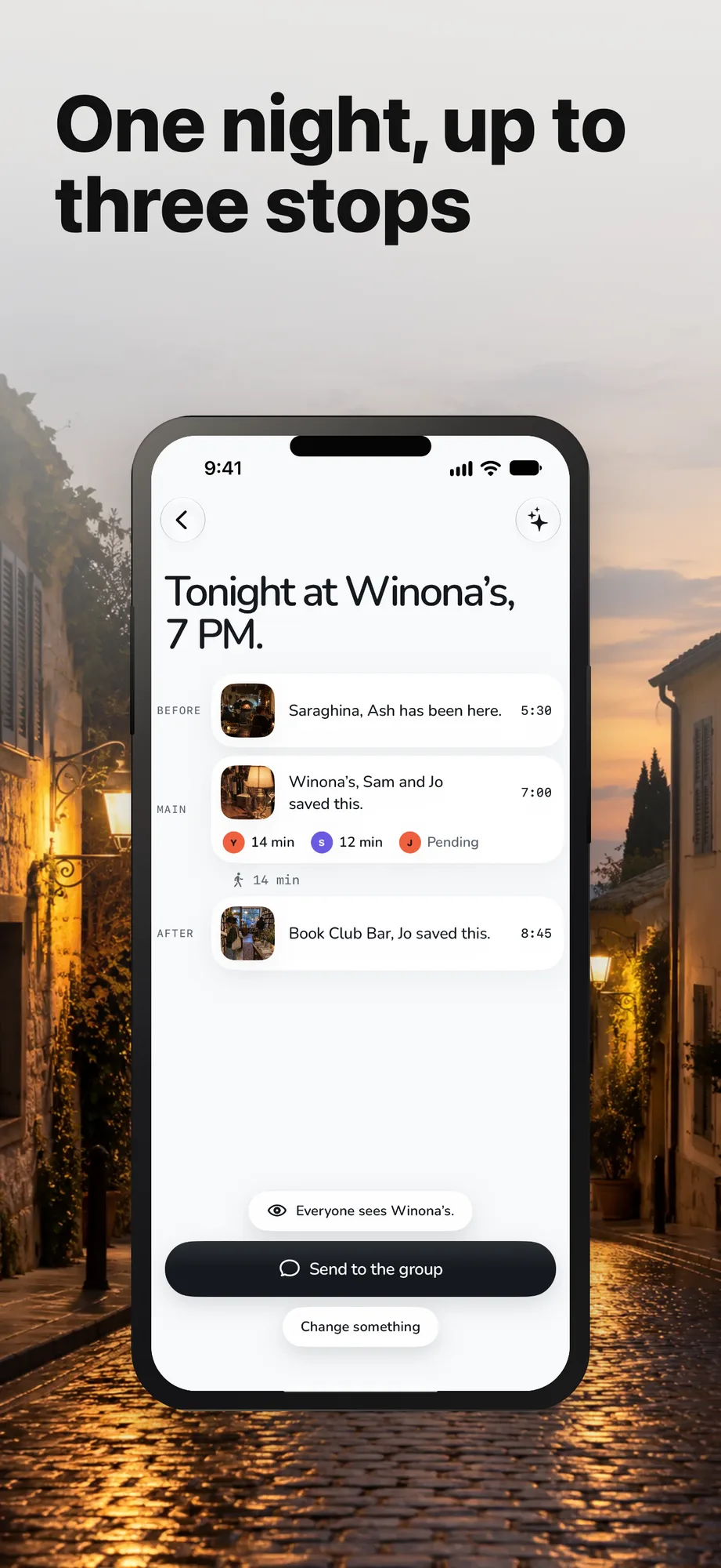
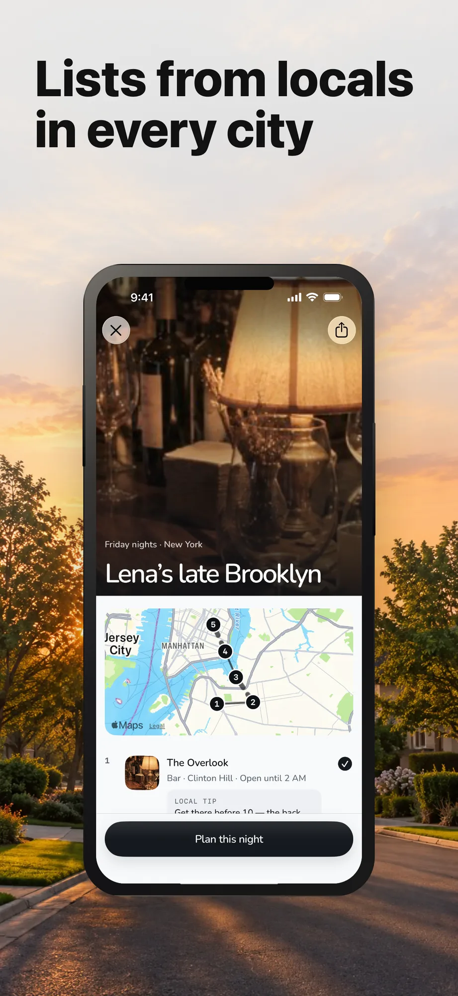
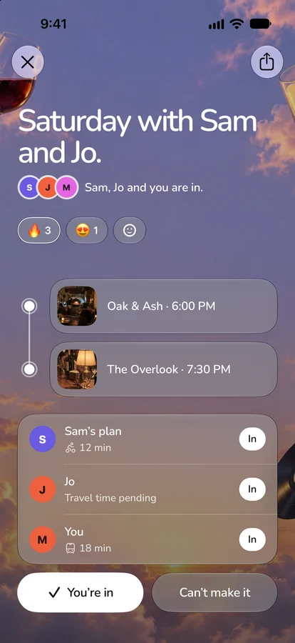
those are four of the six cards on the App Store listing, real captures framed by Shotation over one dusk sky.
Saves are the signal
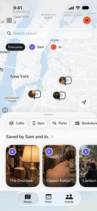
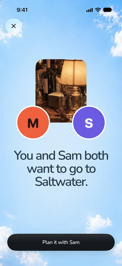
Places opens on a map of spots, and nobody is tracked. you save the cafe you keep meaning to try. saves stay private until you choose to share them, and the first save asks you once. every suggestion shows the friends behind it, and when two of you want the same place, both of you hear about it.
A plan is one sentence
the sentence has four blanks, and each one is a tap.
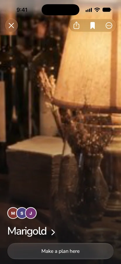
pick Sam and Jo, and the row under the sentence turns into Three places all of you want. tap one and it fills where: Me and Sam and Jo at Marigold on Today at 7 PM. from that, the app drafts the night around the main stop, with somewhere before and somewhere after, each titled with the reason it's there, like "Lucia, Ash has been here." any stop can be swapped for three others.
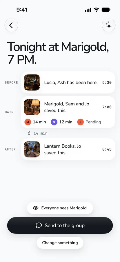
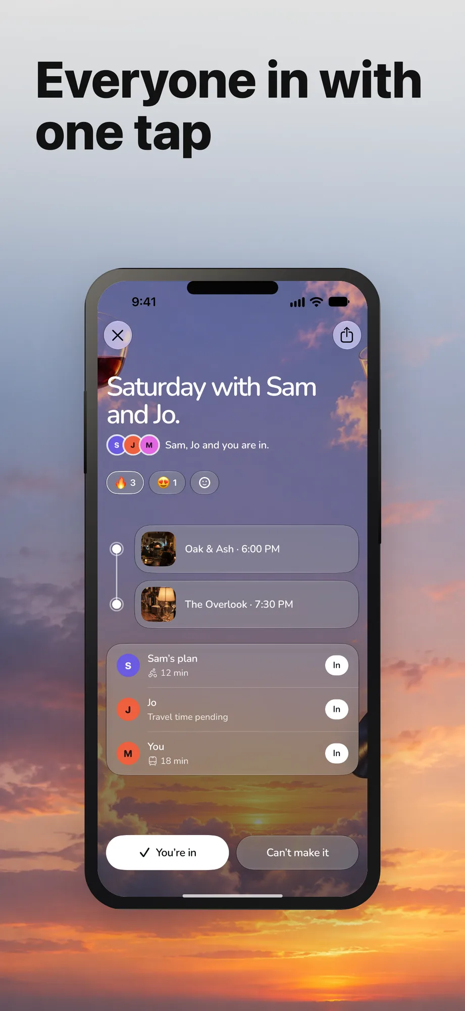
you send it to the group chat. friends answer from the link with one tap, even without the app. if the plan changes after it's sent, everyone gets asked again, and one RSVP counts for the whole night.
leave where blank, though, and the app has to pick the place itself.
Fair is measured in minutes
the geographic middle of three people is only fair if they all travel the same way. a friend on the train, one on a bike and one on foot can be the same distance from a spot and nowhere near the same number of minutes. so the engine that picks the main stop turns everything into minutes before it compares anything.
here it is on a made-up night, run through the shipped code. Sam walks from Clinton Hill, Jo takes the train from Park Slope and Ash bikes from SoHo. the minutes come from the engine's own fallback estimator instead of a live routing call, and everything after that is the shipped ranking, untouched.


first, a center. each person pulls on it by how long their own trip to the plain middle would take, distance at their speed plus a few minutes to get out the door. Sam's 1.6 km on foot is 23.8 minutes. Ash's 3.6 km on a bike is 19.6, and Jo's 3.6 km on the train is 18. the walker pulls hardest, so the center slides 160 m toward Sam.
then it searches a ring around that center. the center circle goes first. the six around it, 60° apart, only get searched if the center doesn't turn up enough, so a good center saves six paid calls. if the ring comes up short, it grows from 1.2 km to 3 and then 10. eight spots at a time get real travel times from a routing matrix, up to 24 per plan, and those are the minutes you see.


then each trip is divided by a budget for its mode: 25 minutes walking, 30 by bike or train, 35 driving. that ratio is the load. it puts a 20-minute walk and a 24-minute train ride on one scale, at 0.80 each. a spot where anyone's load goes over 1 is out before anything else gets a vote. on this night that throws out three of the six, all because of Sam's walk. Velvet Room sits right on the plain middle. it survives, in third.
The worst trip decides
the score for what's left is a blend: fairness 0.5, taste 0.3, context 0.2. fairness is 1 − (worst load + a quarter of the spread) ÷ 2. on this night taste and context come out equal for every spot, so the score is 0.35 plus half the fairness.
| worst load | spread | fairness | score | |
|---|---|---|---|---|
| Lucia | 0.80 | 0.098 | 0.588 | 0.644 |
| Marigold | 0.84 | 0.098 | 0.568 | 0.634 |
Lucia wins even though Ash's ride there is three minutes longer. Ash has room to spare on a bike and Sam doesn't on foot. one minute of Sam's walk moves the worst load by 0.04, while three minutes of Ash's ride barely touch the spread.
everything else is kept small on purpose. the vibe you typed adds at most 0.15. a provider rating moves a spot by ±0.05, enough to break a near-tie. weather only ever subtracts, at most 0.12, against a fairness term that swings about 0.25 across the legal range. the comment next to it: "A park in a downpour slides; it never hands the night to a place nobody can reach."
the engine also remembers who trekked. when a plan locks around one person's long trip, that person pulls 1.5× harder on the next center for 30 days, so the same friend doesn't make the long trip every time.
the original research plan was fancier: draw everyone's reachable area as a polygon and intersect them. that's in the code as a stub with one job. it only goes in if it clearly beats the ring on the same ten New York test scenarios.
The model reads the vibe, the math picks the place
there's a language model in here, with a narrow job. the seam is one line at the top of the file: the LLM does LANGUAGE, the geometry does FAIRNESS.
the model reads what you typed, like "somewhere quiet enough to talk", and scores the spots that already passed the budget gate. it gets names, categories and minutes, and never coordinates, people or the center. it can reorder fair spots. it can't add a spot or change anyone's minutes.
it also writes one short line per spot, and that line gets treated like copy from a stranger. it's cut to one sentence, eight words and 60 characters at most. an exclamation mark drops it, and so does any word from a list that includes discover, unlock, seamless and journey. a dropped line falls back to something we can prove, "Within the travel limit for everyone included", or to nothing. if the model is slow or down, a keyword matcher takes over, because the finder must never fail just because language failed.
the stops before and after the main one come from code, not the model. each has to be a verified walk of 15 minutes or less from the main stop, within 1.2 km, and open at that hour. a restaurant gets a bar or a cafe before it, and a bookstore gets coffee. when not enough places fit, nothing widens quietly. it stops and shows the organizer named options.
Fair goes without saying
the engine already throws out any spot where someone's trip is over budget, so on most plans there's nothing to say about fairness. the comment above the code that decides: otherwise fairness goes without saying.
so the plan shows each person's minutes and nothing else. a line appears only when one trip is clearly longer: at least 15 minutes more than the next longest, and at least half again as long. both have to hold.


the line bends at 30 and 45, where the two rules swap. below a 30-minute next trip, the 15 minutes is the stricter one. above it, half again as long is. B is only 12 minutes longer, so it stays quiet. C is 16 minutes longer and still stays quiet, because 56 isn't half again as long as 40. A gets its line: "Jo's trip is the longest at 41 min."
the travel minutes come from Apple Maps first, with Google's matrix as the fallback. Apple's terms keep its data off non-Apple maps, and the app's map is MapLibre, so Apple's answer only ever shows up as text and never as a pin or a line. the app went through five maps to get here.1
The same minutes run the night
on the day, the plan becomes a Go card: when to leave, how to get there, the next stop and getting home. a leave-by push arrives, and a Live Activity counts down on the lock screen.
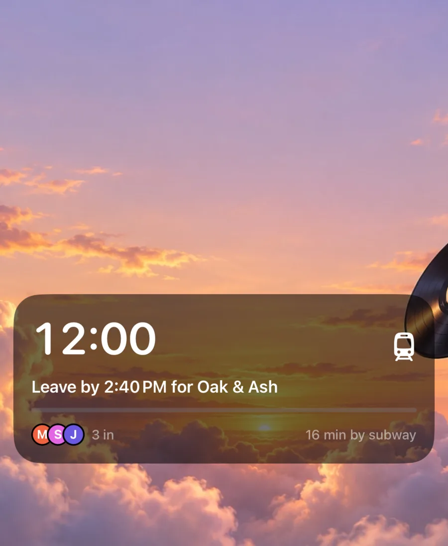
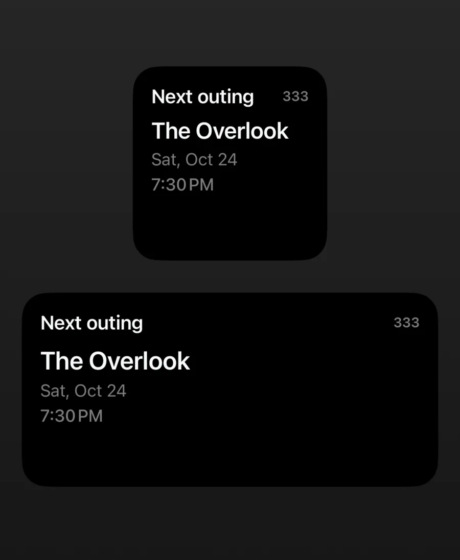
a missing starting point never blocks a plan. if Jo hasn't shared where she's coming from, her travel time says pending and the plan still goes out. between stops it tells you where to head next. the next morning one tap asks how it was, and a visit only counts once that person says they went.
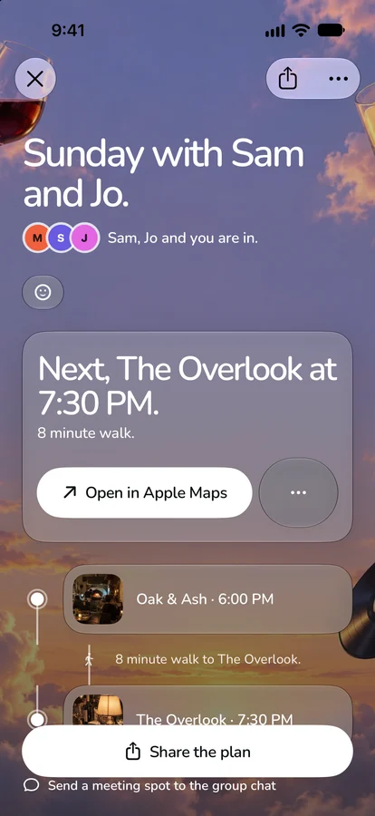
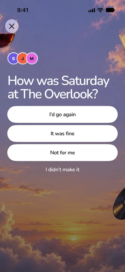
One Worker keeps the minutes honest
333 is a SwiftUI app and one Cloudflare Worker, and every minute on a plan comes from the Worker.


the phone holds no keys. places, routes and photos all go through the Worker, and a zod contract in packages/protocol generates the Swift types, so CI fails if the two ever disagree about a field. only the Presence package may import CoreLocation, and precise coordinates never land in the database. a starting point belongs to the person it describes, so nobody can put a friend somewhere else to make the math come out their way.
place search runs on 333's own catalog, US third places from Overture Maps with OpenStreetMap hours. a place with no hours on file is never shown as open.
the same Worker serves 84 city guides, two lists of five places locals recommend for every US metro over a million people and 25 college towns. the same files feed the app's shelves.

that's the app that launched in october. in july it was a different app.
It started as a calculator and a ritual
on july 23, 2026 the research went through what already existed. there are a lot of midpoint sites, and the research doc put them in one line: they're "calculators, not networks". one person types in everyone's address, gets an answer, and nobody comes back. Partiful starts after the venue is picked. Corner and Beli are about your own taste. Bump shows where your friends are and stops there.
so the first plan was the math plus a ritual. put the group on a map, work out each person's trip, suggest three spots where nobody's trip is much worse than anyone else's. then once a week, on the group's day, at 3:33 in the afternoon, a suggestion would drop. the Worker's cron still ticks at :03, :18, :33 and :48 past every hour, so one tick lands on 3:33 pm in every time zone that's offset by whole, half or quarter hours.
the name had to carry all of it. 333 is a third place, three or more friends, an angel number, and one more than 222, an app for meeting strangers that texts at 4:22.
"one-up of 222" is in the research doc, word for wordthe research, the scaffold, the first TestFlight build and the backend all went out that same day. five days later the drop card looked like this.
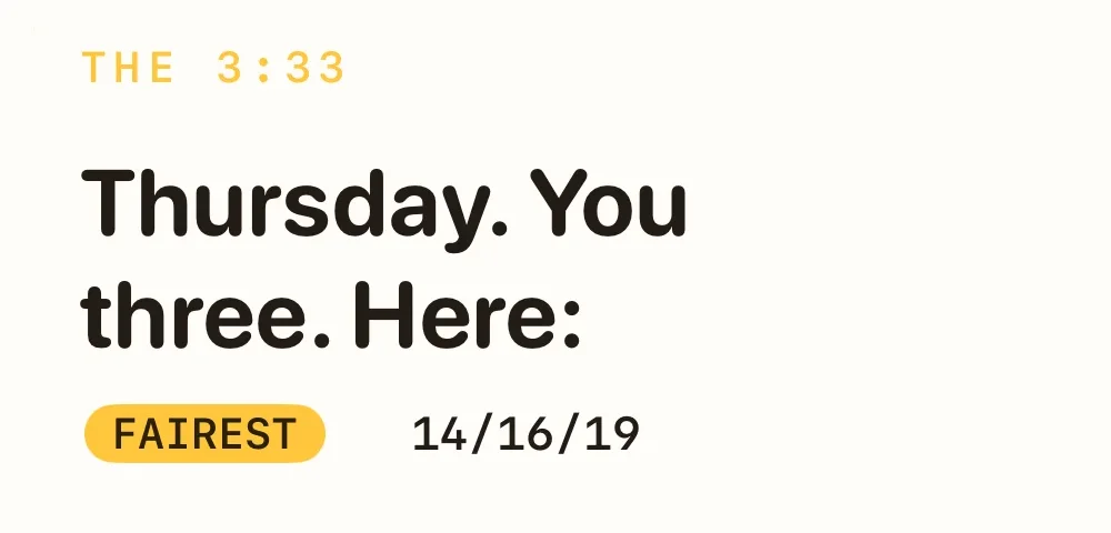
Thursday. You three. Here: and three spots with three numbers each, like 14/16/19 MIN, one per friend. the one the math liked best got a FAIREST badge. in july, everything in the app came back to that card.
The reference won every piece
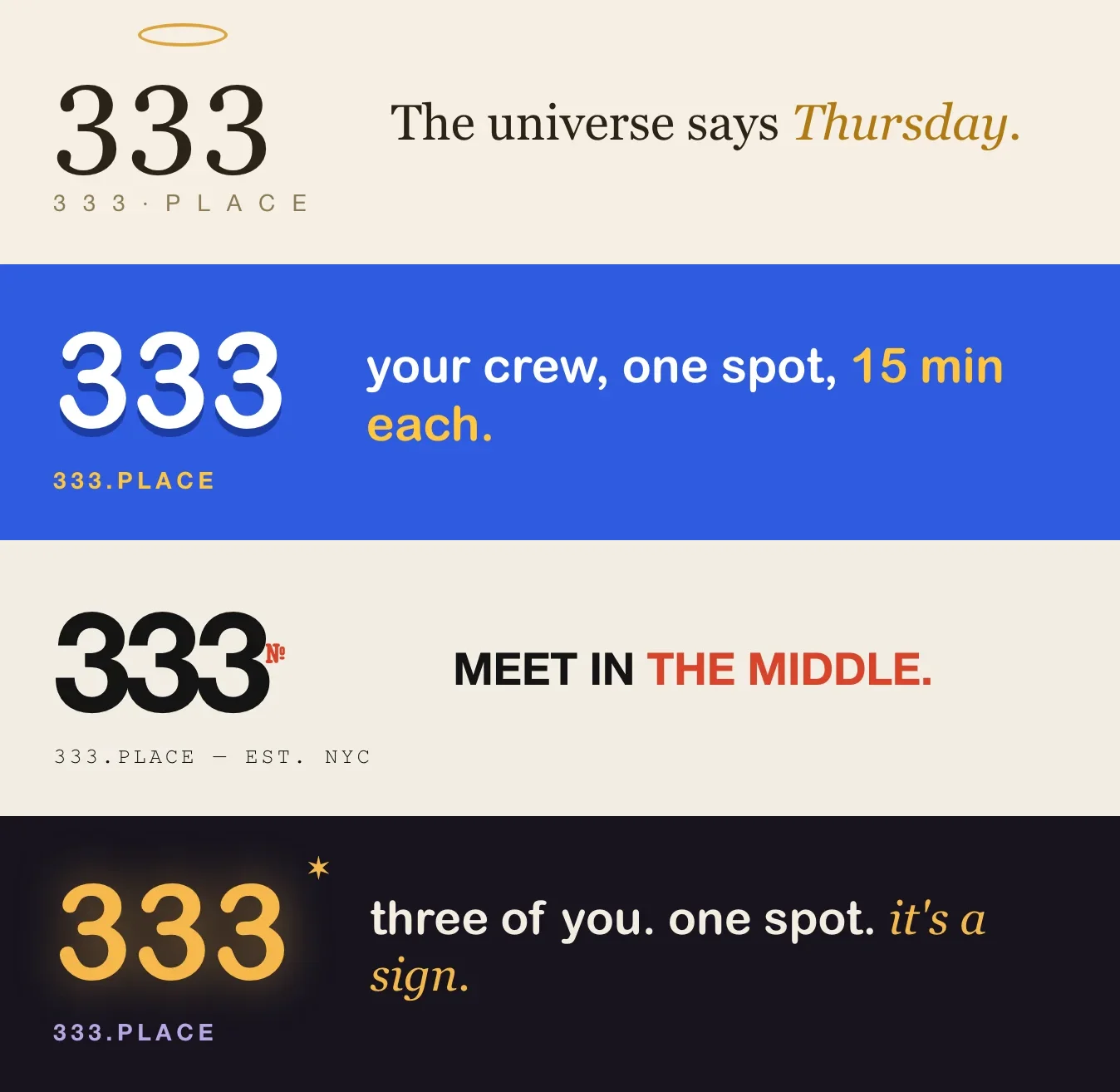
before there was a real app, there was one screen drawn four ways: Mystic Hour, Toy City, Downtown Editorial and Mystic Toy. each board had the same map and the same 3:33 drop. only the world around it changed, down to the line on the card.
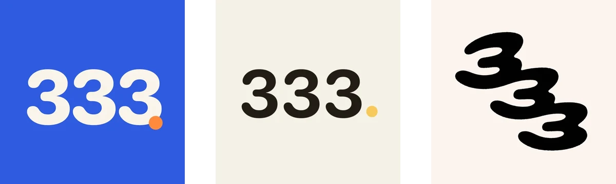
the first icon went geometric, "333." in a heavy sans with an orange period. five days later it was ink on paper with a yellow dot.
the day after that, every surface of the app got judged blind. eight screens, each next to a real screen from the app it borrowed from: Corner, Airbnb, Partiful, Beli, Find My and Wrapped. the commit message: the reference won every piece.
the yellow and the accent colors went, the chrome turned black and white, and photos carry the color now. every primary button lost its gradient. the logo became three hand-drawn 3s falling into each other, shipped as the icon on july 29. it's still the icon.
some of my test feedback went straight into commit titles: "why cant you set anchors" — because the card was a poster.Friends, not crews
the first version was built around a crew. you set up your group, the app found the middle of it, and every screen started by asking which crew you were looking at.
i used it, and that switcher was in the way. on july 28 i wrote down what i actually wanted, and the pivot doc quotes it word for word:
"core thing is the structure is not group you need to switch groups. Its more like zenly / bump where its your profile and you add friends like snapchat map."
the switcher died. the geometry survived untouched, because the fairness engine always took a list of starting points and never knew what a group was. the core math is still the same functions today.
the studio drew three ways out. A made the app a list of chats with a plan as a card inside one, the way LINE drops a poll.

B had no groups at all, just people you pick like the recipients of a text. C was "the most 333": a room with a link that closes itself at 4am.

A won in the studio. the launch app went one step further and gave the chat back to iMessage. 333 owns the places, the plan and who's in. the talking stays in the group chat.
The code is the spec
by mid-august there were 4,400 lines across seventeen spec docs, plus eight audit and plan files at the root. they disagreed with each other and with the app. the commit that deleted them says why: "Agents (and I) kept building to whichever page they read first."
it also stripped 922 citations of those docs out of code comments, and the reasoning each one carried stayed next to the line it explained. the CI check that used to make sure doc citations resolved now makes sure none are left. CLAUDE.md went down to the eight rules that actually bind.
the next day every screen was rebuilt on stock iOS 26 parts. the rule since then is to use the native component and only hand-roll a control when the native one can't do the job, with a comment saying why.
the day after that, the app got a studio: every screen drawn in HTML at real device metrics, on the same generated color tokens as the app, so trying a design doesn't need an Xcode build. it started with 21 screens. then six agents took one page each, and every new screen had to name the Mobbin search it was grounded in. that made 247 screens across 14 pages. some borrow one feature hard from one app, like Waymo's trip editor for building a night.

Thirty-two questions, seven overrules
on october 11 i built a decision board with thirty-two questions, including "What is the Places home?" and "Which notifications earn a push?" every option shows live phone mockups, and one is marked recommended. you pick, add a note, and Copy decisions puts the whole thing on the clipboard as a table to paste back to an agent. there's also a button that says Pick all recommended.

i didn't press it, but most of the time the recommendation was right. the home screen shipped as recommended, the map whose sheet becomes shelves like "Saved by Sam and Jo."
on seven of the single-answer questions i picked something else. for starting a plan, the board recommended typing or saying a whole night, like "Saturday night, five of us, near the L", and getting a draft back. i picked the sentence you fill in. the AI still drafts the night. it just starts from four tapped words instead of a typed paragraph.

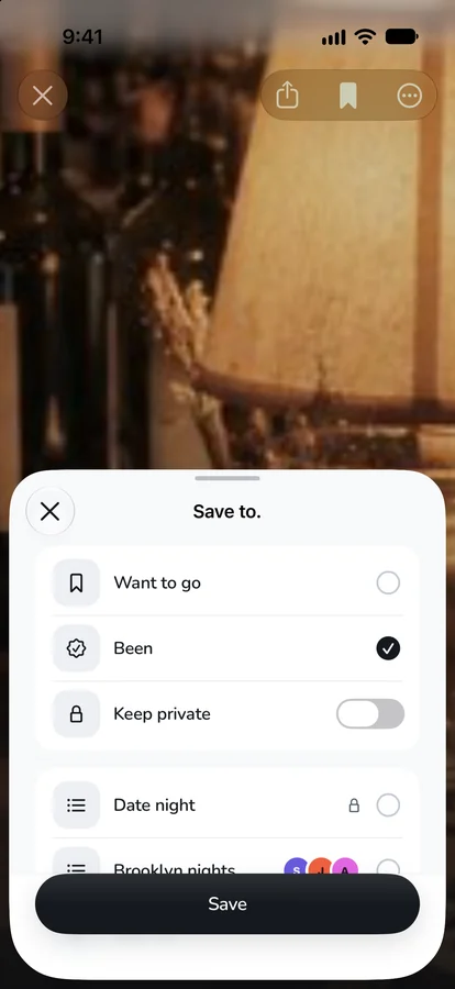
saving got a list picker instead of one tap. fresh places show up as a map with three pins instead of three cards. the plan became a timeline on a dusk sky instead of an invitation card, and the Plans tab became a week instead of "next up". for fairness, the board wanted to say it out loud every time the long trip rotates: "Closer to Jo this time." i picked the silent rule above.

the picks went into CLAUDE.md as founder decisions, on top of the hard rules. two days later the whole iOS UI was rebuilt from scratch on them, and the domain moved to 333.place. the 3:33 drop, Wrapped, streaks and in-app chat are parked as deferred, and the live map of where your friends are is gone.
Still called 333
in september the welcome screen and the landing at 333.place moved to a sky, with an espresso cup, a red glass and a tennis ball drifting at the edges. the only 3s on it are the mark in the corner.
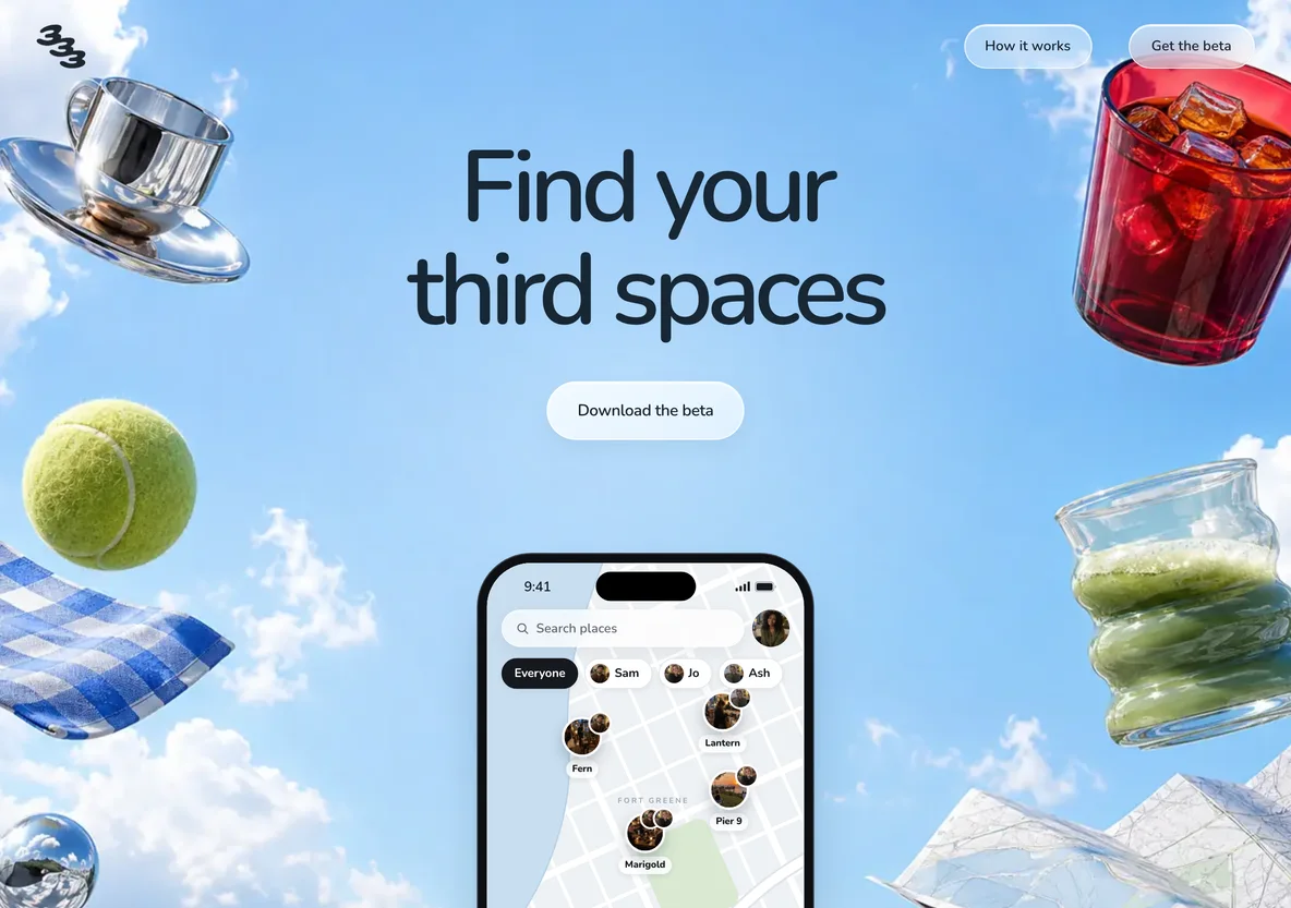
the app is named after a time of day it no longer sends you anything at. the math from the first week still picks where you go. it just stopped saying so.
- Mapbox in the research, Apple MapKit in week one, MapLibre with Protomaps in august, native Google Maps in september, then MapLibre on OpenFreeMap's free tiles, with Apple Maps answering travel times as text. ↩