Four apps, one conversation
The company behind Wafflr, Fooball, splitlobby and 333, and the small website that holds them.
The Friendship Company is a few of us who grew up together in Irvine, making small apps for friend groups. its website is 110 words and a row of signatures. the sentence that names the apps went through five versions in six weeks. this page is about why something that small took that long, and what's under it: a CSS curve, one list, and a pen clock.
The company is younger than its first app
when college scattered us, every app for staying in touch turned out to be built for broadcasting. so in january 2025 we started building one just for us. that was Wafflr, and for a year and a half it was just the app we made.
on june 1, 2026 we started a second one, a World Cup game for the same group chat. eleven days later, at 12:31 in the morning, The Friendship Company had a website.
the brand is the place. the lockup from that night says of Irvine, over palms at dusk.
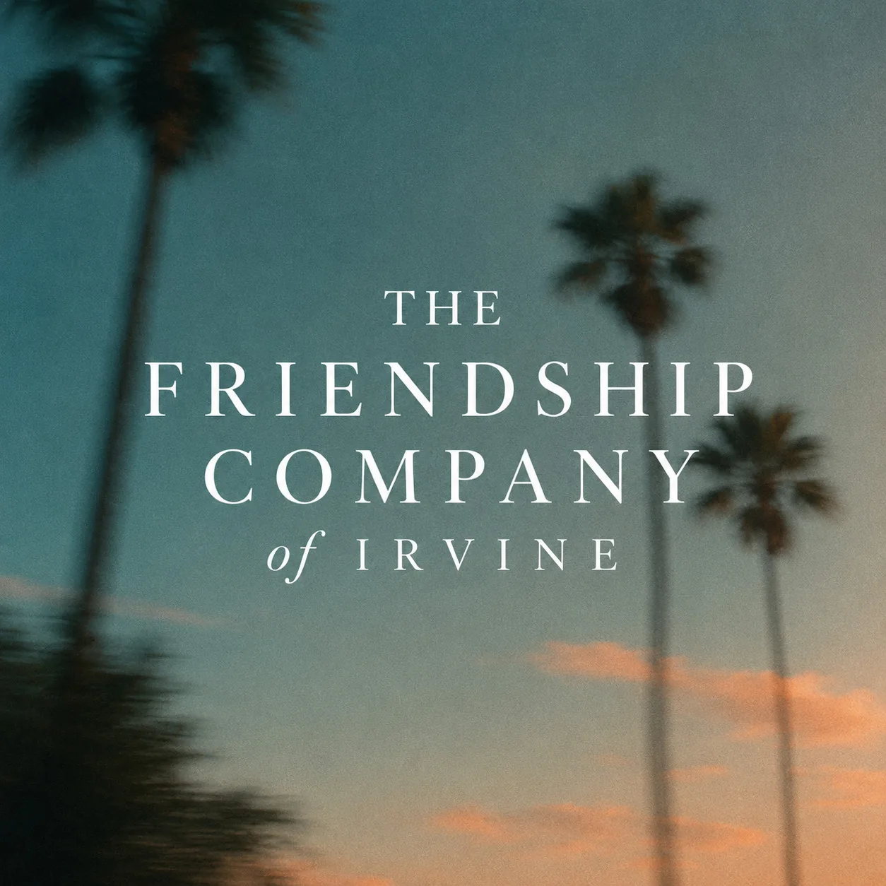
the palette came from the same evening: paper #f7f2e8, ink #2a3038, a sunset orange #d97a35, and a dusk blue. two serifs, Cormorant for display and Newsreader for body. a film grain sits over the whole page at 5% opacity, drawn by an SVG noise filter inline in the CSS, so there's no image to download. a later commit trimmed the fonts to the four variants the page uses, which it says cut about half the font payload.
The postcard lasted seven minutes
the first friendship.co was a postcard. "The Friendship Company" typed on paper, with an oil painting of palms over a cove hidden underneath.
rest the cursor on it and the painting develops. at rest the painting is invisible, scaled up 4% and filtered with sepia. on hover it fades in over 1.1 seconds while the scale and the color settle over 1.6, the scale on an ease-out curve. the scale arriving later than the opacity is what makes it look like a photo coming up in the tray.
phones don't have hover, so on a touch screen the painting is simply the hero.
seven minutes later the commit "Simplify to one-paragraph lander" replaced all of it with one paragraph. the postcard shrank into a hover card on the company's own name, where it still lives.
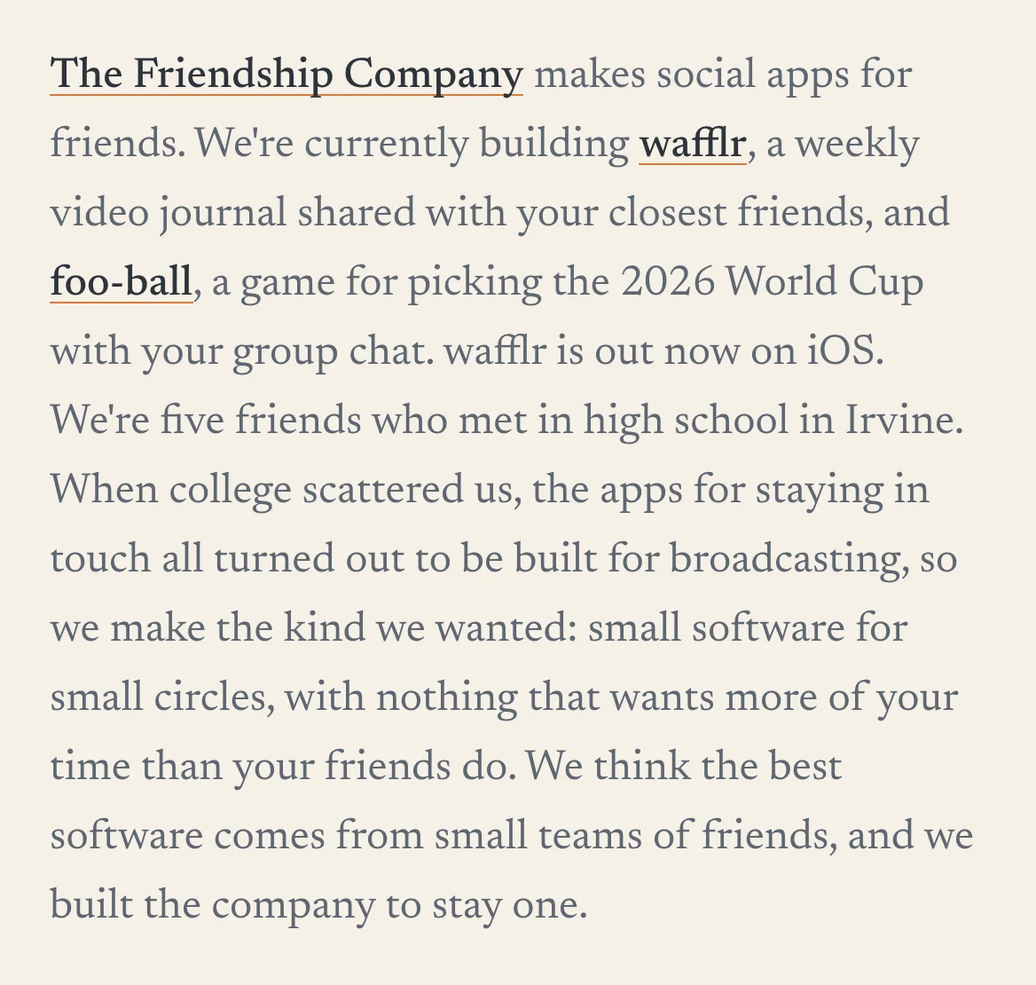
two more passes that night changed "high school" to "elementary school", then traded the backstory for the manifesto that's still at the top: social media "stopped being about your friends and became a performance for strangers."
Every launch pushed the why down
in july the list grew fast. splitlobby went in on july 23. twenty minutes later Fooball's line stopped being about the World Cup. 333 went in the next day.
| date | what changed in the apps sentence |
|---|---|
| jun 12 | wafflr, "weekly video updates for your closest friends", and foo-ball, "pick the 2026 World Cup with your group chat" |
| jul 23 | splitlobby joins, "which splits the check without splitting the friendship". foo-ball becomes "a fantasy soccer league just for your friends" |
| jul 24 | 333 joins, "which finds the third place that's fair to everyone in the group chat" |
| jul 24, night | 333 becomes "a shared map of third places your whole group can get to" |
| jul 28 | reordered into one conversation |
the jul 24 rewrite of 333 has its reason in the commit. "fair" presupposes a dispute being settled, and the app is about finding and keeping spots, not arbitrating them.
that's the answer to the six weeks. every launch rewrote the sentence, and every rewrite pushed the reason for the company further down the page. on jul 24 the why moved into the headline and the apps got their own paragraph underneath. the comment in the code: "the list grows with every launch, so it can't be what pushes the why down."
this was the apps paragraph that night. each line says what the app is, in no particular order.

four days later it got its last rewrite. each line now says what the app does to the conversation, in the order a conversation happens.

The order a conversation happens in
Wafflr starts it: one short video a week, to a few close friends, on the App Store since february 2025. Fooball keeps it going with a fantasy league, so there's a reason to argue every gameweek. splitlobby makes sure the check never ends it: the host scans the receipt and friends claim what they ate from any browser. 333 continues it in person, with a shared map of the places your friends love.
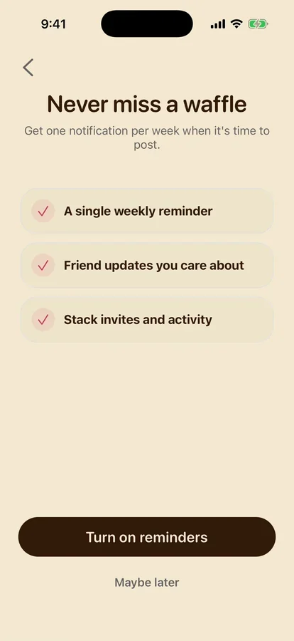
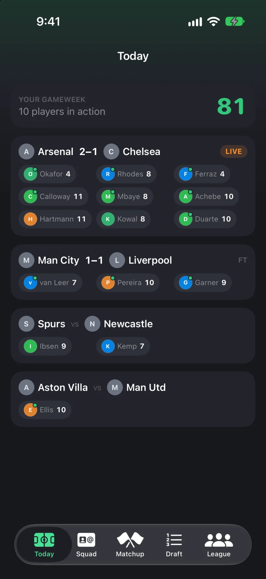
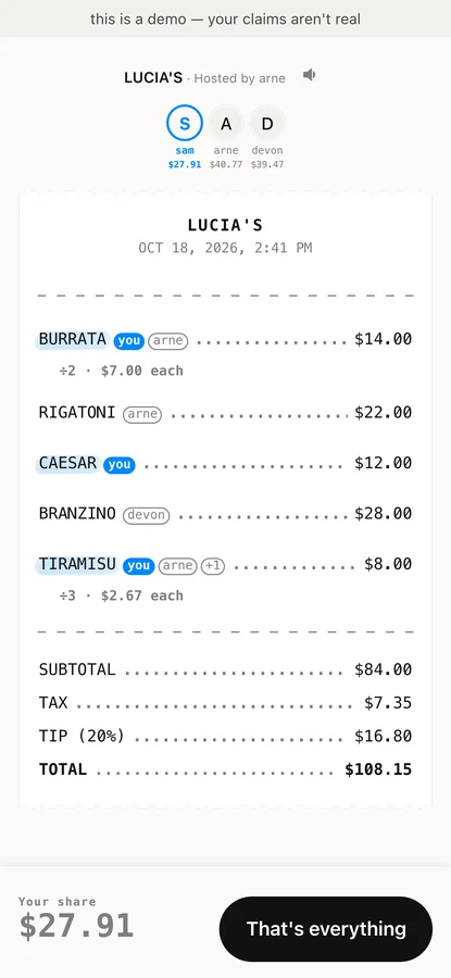
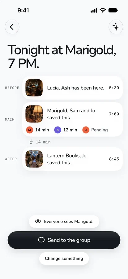
they share one test: nothing in them is built to keep you scrolling. the 333 research put it as "gamify reunions, not counts".
A critic that can't be argued with
the newer apps were polished in a loop. a lead agent splits the app into small pieces and writes one brief each, but never writes code. a Codex builder closes one gap per brief. then a critic with fresh context, which never sees the builder's reasoning, puts screenshots of the running app next to the best apps in the category and names the single biggest gap. that gap is the next brief. the prompt ends with "keep going until I stop you."

for splitlobby the bar was the best consumer money apps, with one rule: it had to stay unmistakably itself.
The card overshoots on purpose
each name in the apps paragraph opens a card. it's pure CSS, no JavaScript. the card starts at −4° and 92% scale, 10px above where it ends, and settles at +2° and full size.
the curve is cubic-bezier(0.34, 1.56, 0.64, 1) over 500ms. the 1.56 is the point. a control point above 1 lets the value run past its target and come back, so the rotation goes −4°, through +2° at 185ms, out to 2.59° at 287ms, then back to 2°. the scale peaks at 100.8%. a card that lands exactly on its mark looks placed. one that swings 0.59° past it looks dropped on a table.


opacity runs on its own clock, 350ms, so the card is fully visible before the swing finishes. the sunset underline thickens from 1px to 4px at the same time.
since the 12:38 rewrite every card drops below its word instead of above it. at the top of the page, a card above the company name would fall off the screen. on a phone the names are plain links. the cards are for a cursor.
One list feeds six surfaces
every launch touched the same facts in six places: the homepage sentence, the hover card, the meta description, llms.txt, the WebMCP tools and the agent tool catalog.
so on july 23 all of it moved into one array, PRODUCTS. each entry has a name, a url, a platform, a blurb that gets woven into sentences, a fuller description for agents, and a preview image. everything else is derived from it, down to the Oxford comma before the last app. a four-line helper, listConnector, puts nothing before the first name, ", and " before the last, and ", " before the rest, so the sentence reads right with two apps or ten. the meta description is built from the same clause, word for word, so search results say what the page says.


it paid off the next day. adding 333 was one entry, and the commit says so: the sentence, the hover card, the meta description, llms.txt and the agent catalog all followed.
the agent side is small. request the homepage with Accept: text/markdown and middleware returns the company as markdown, with a rough token count in an x-markdown-tokens header. in the browser, three read-only WebMCP tools expose the same facts, and /.well-known/agent-tools.json lists them for crawlers. robots.txt says plainly that search, AI answers and AI training are all welcome.
Every stroke gets at least 100ms
the footer has our signatures. when you scroll to them, they sign themselves, one after another, at the speed of a pen. they're real handwriting, so this page only shows mine.
each signature was traced from ink into filled outlines, one closed outline per pen stroke, in the order the pen moved. the trick is a mask. the same outline is drawn again as a stroke 84 units wide, and the ink only shows where that fat stroke has been. every mask stroke starts with its dash offset equal to its own length, so it draws nothing. GSAP sweeps the offset to zero and the ink comes up behind it.
the whole row gets a pen-time budget of 4 seconds, split across every stroke in proportion to its length. the six signatures add up to 27,162 units of outline, so each unit gets 0.147ms. my first stroke is 1,201 units long and takes 177ms.
a dot over an i would get 9ms, which is one frame or less. so every stroke gets at least 100ms, which is what a 679-unit stroke would get anyway.


the floor costs more than it looks. 37 of the 48 strokes in the row are shorter than 679 units, so the floor turns a 4-second budget into 6.56 seconds of pen time. the first stroke starts at 150ms, there's 30ms between strokes and 200ms between signers, and the full row takes 8.97 seconds: 6.56 + 0.15 + 1.26 + 1.00. mine is first, and done at 1.06.
those numbers came from one night. the first pen-drawn version had a 9-second budget, 450ms between signers and a 150ms floor. two minutes later the budget was 4 seconds, the pause 200ms and the floor 100ms.
the signers later became one array, so adding or reordering a signature is one edit and the layout works out every x offset. hover a signature and that person signs again from a prebuilt timeline. with reduce motion on, everything shows fully inked.
in september one more signature joined the row, with a second version of the trick. the scanned ink stays as an image, and thin centerline strokes, 18 units wide instead of 84, reveal it. that keeps the real texture of the pen instead of a traced outline.
Small on purpose
four apps, and the site that holds them reads in under a minute. a company built around "nothing that wants more of your time than your friends do" can't have a homepage that wants more of yours.
the footer has said the rest since the first night. Just some kids from the 949.